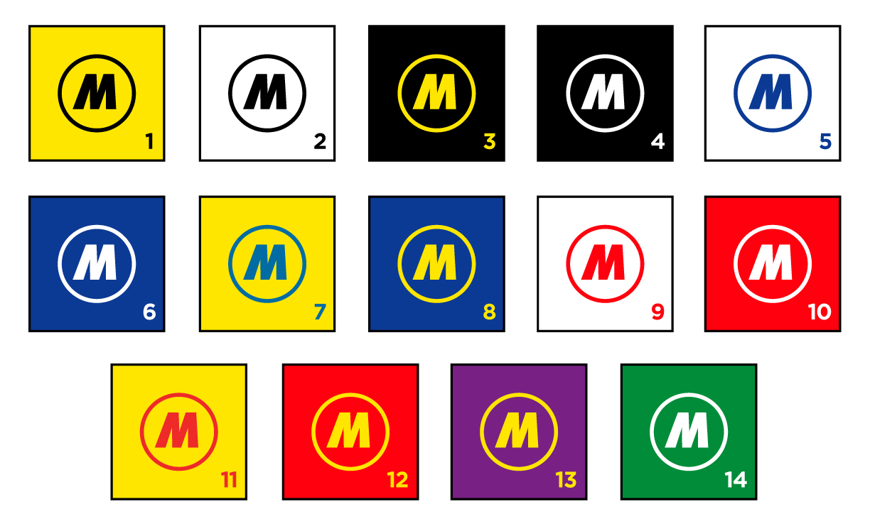
High color contrast on a billboard is proven to improve recall by 38%, so advertisers need to pay special attention to color choices to maximize their advertising return. Color choices and combinations will enhance the readability of your billboard advertising and create a strong visual memory of your message.

The chart shows a scale of readability with the first combination being the sharpest followed by other examples that still produce good contrast. The chart ranks the 14 most visible color combinations, with 1 being the most legible. These combinations work because they pair colors that can be strongly separated by the human eye. Black contrasts well with any color with a light value, and white works with colors of dark value.

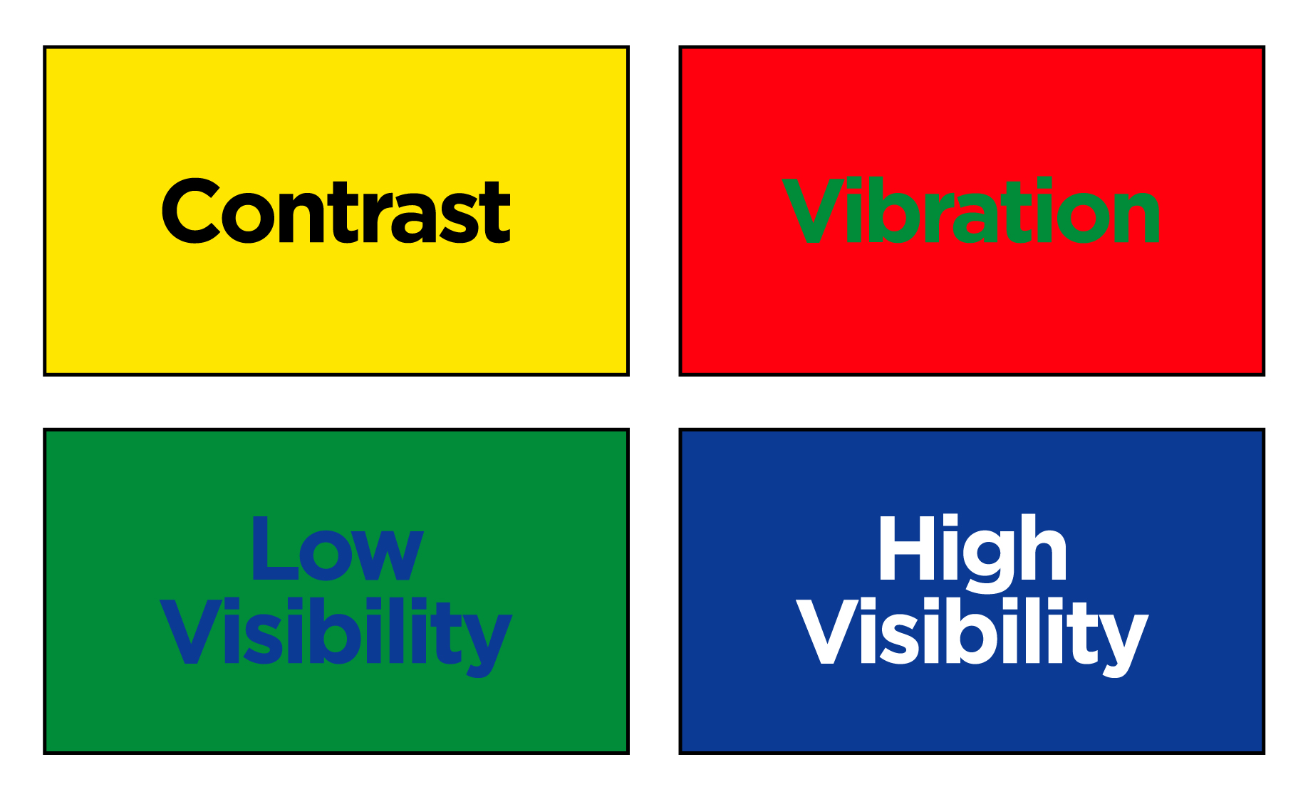
Some pairings will not work because the colors are too similar in hue or value. Green on red creates an optical distortion as the human eye tries to process the similar wavelengths of the colors. Green and blue will blend together for a low visibility effect. Color pairings can be tested by making a black and white photocopy of the proposed colors. If they separate well in black and white, the pairing will work for outdoor designs.
Why are stop signs red and hospital signs blue? Color messages are ingrained and carry their own subconscious meaning. Color will impact your target audience before the words and numbers so advertisers need to consciously choose colors that invoke positive responses and drive motivation around their advertising. Research shows that brightness and intensity of the colors strengthens the response. Examples of common color associations for businesses are blue for healthcare, dark green for financial services, dark blue for business, light pink for romance, turquoise for cleaning products, etc. Example of motivational colors are red to invoke action, yellow to create optimism and orange to increase appetite.