The building blocks of impactful creative
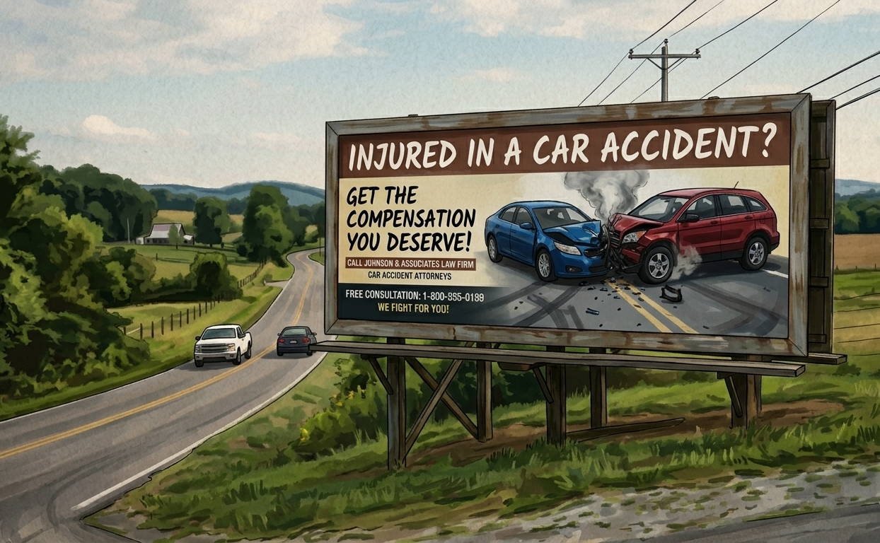
While AI is a helpful starting point for inspiration, most AI resources aren't available in a usable aspect ratio or file resolution. Because AI imagery isn't editable, we'll recreate it using professional graphics software to production quality standards. Please note that it is possible that some elements or aspects of the AI generated sample will not appear in the final version and variations are to be expected. AI generated images of people or products will be replaced with similar stock photos.
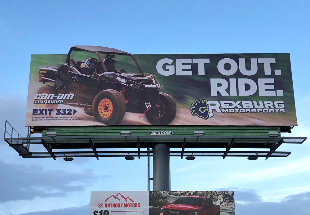
The golden rule of outdoor design is SEVEN WORDS OR LESS. The best, most impactful creative is brief. You know it because you have seen it. Drivers have plenty of time to read good creative and will be drawn to it, but wordy billboards are discouraging. Our sales reps and creative team are skilled at selecting few words to say much.
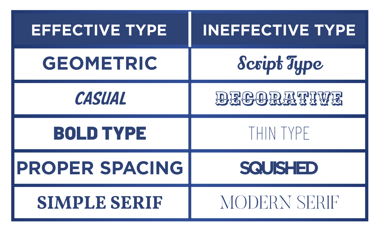
Fonts with even thickness will be easy to read. Ornate fonts with serifs, thick or thin lines, will be difficult to read. Letters must be scaled for distance, too small and they can’t be read.
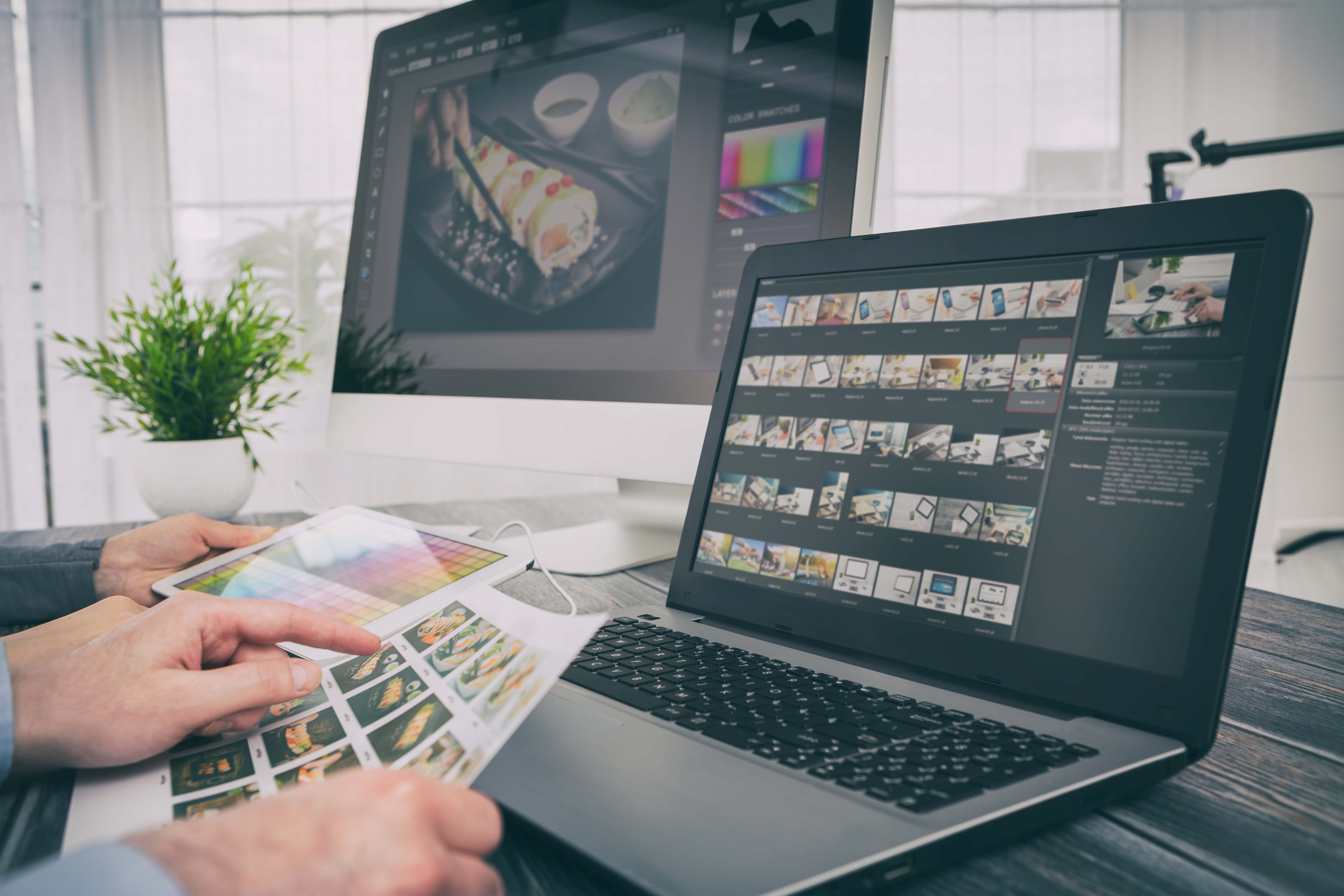
Images are powerful storytellers. They can immediately set the tone for your brand or showcase your product. Additional images dilute the power of the story but are maximized with one well-chosen image. Advertisers can supply high-resolution photos for their custom billboard art at 300 dpi for billboards and 72 dpi for digital displays. Don't have an image? Meadow can work with you to source a stock photo from our subscription sites as part of your design service.
Find stock images on these sites!
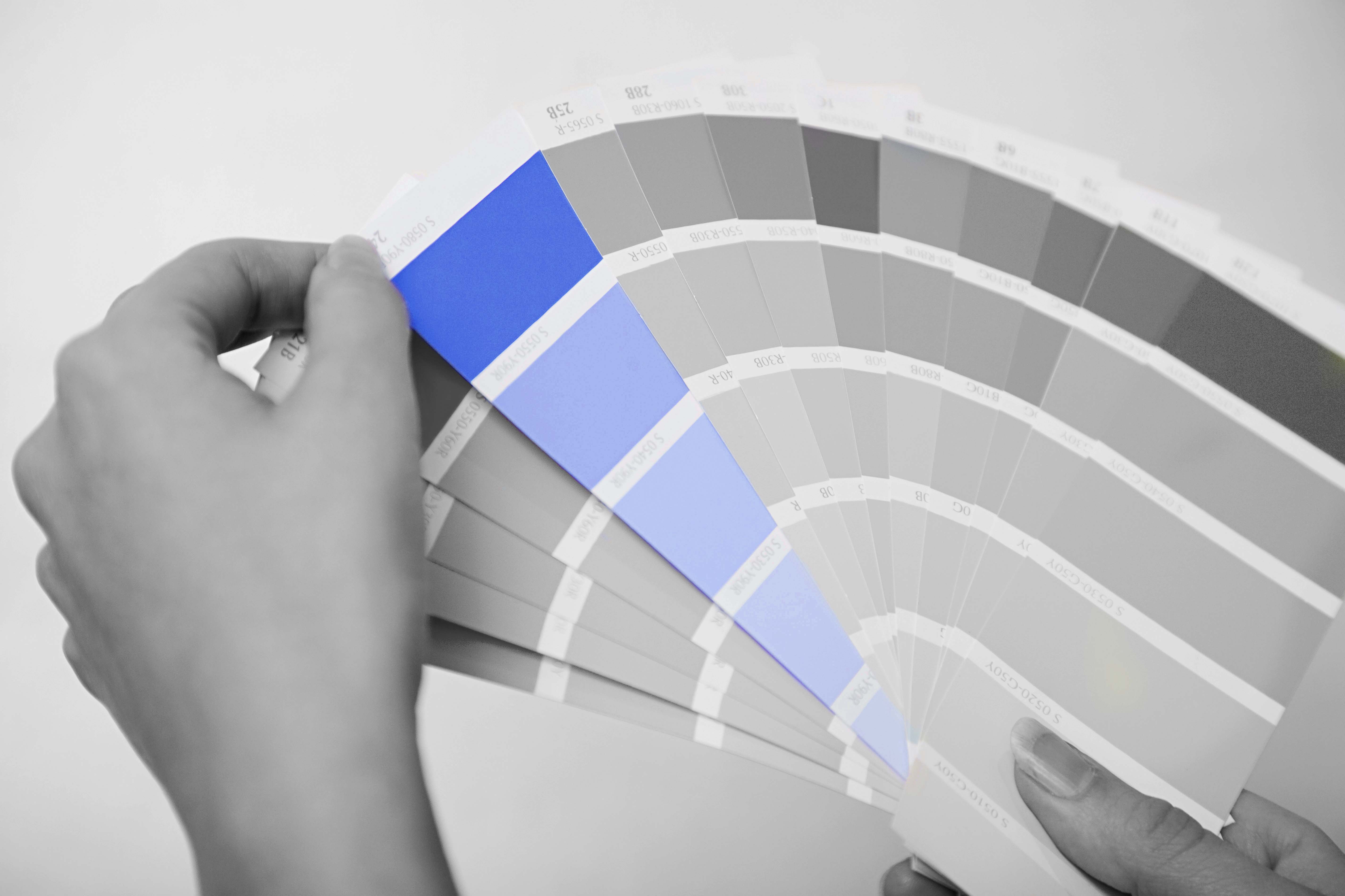
Select colors for the lettering and background that are in sharp contrast so the words and images will “pop” off the background.

Go beyond good basic design to further reach your audience with a touch of HUMOR, SURPRISE, INTRIGUE or BEAUTY and they will remember you when they make a buying decision.
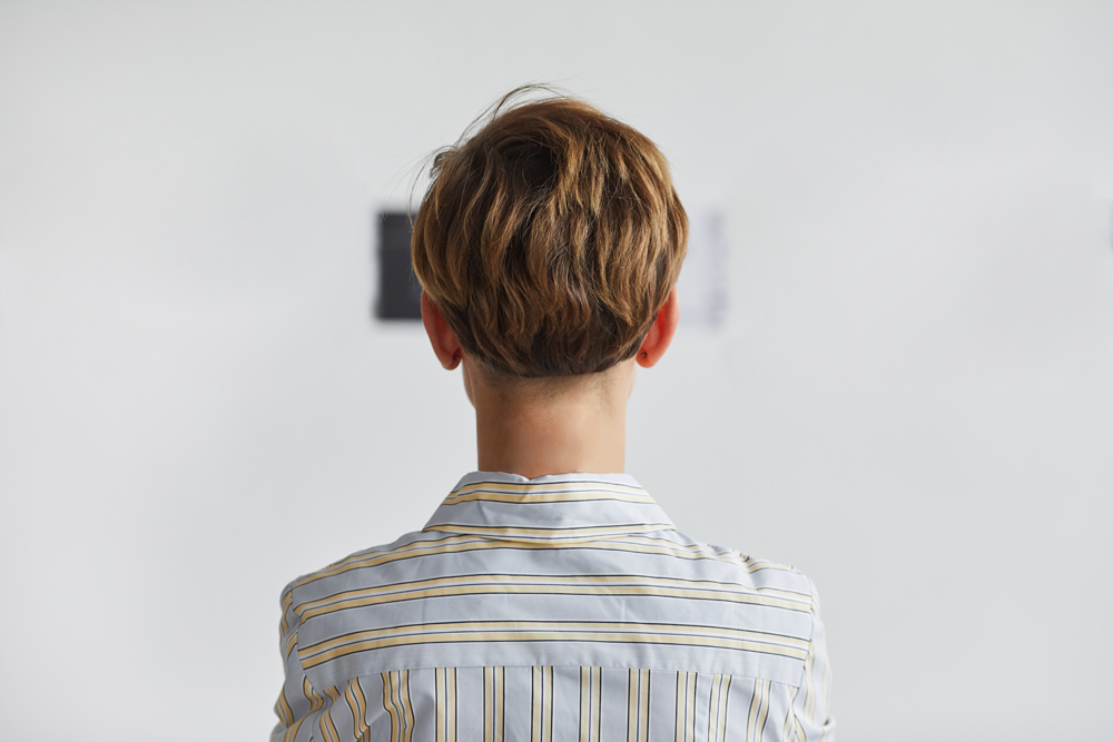
Artwork can be tested for readability by stepping back ten feet from your computer screen or printed layout and allowing yourself a few seconds to take it in. How much did you see? What could you not read? The contrast can be tested for potential visibility by making a black and white copy of the art to see if the paired colors separate.
Your creative work is precious to us and secures our mutual success.