How Typography can Elevate your Billboard Design
Typography is one of the most difficult elements of a billboard design to get right. But it’s so crucial to the design because that is what ultimately communicates the client’s message. A billboard’s typography needs to be readable, but that is just getting over the bar for what billboard artwork should be. The best billboard artwork uses typography in unexpected ways and sometimes even breaks the industry mold.
What Not to Do
Typography on a billboard usually must be big and bold. If the type is too thin or too small no one will be able to read it. Similarly, if the font if too bold and the kerning is not adjusted, it can be difficult to read. If the type is a script or heavily stylized it can be difficult to read quickly. Low-contrast colors are also a no-no. Black text on red, or green text on blue is not going to be easy to read from a car driving past the sign.
Be Unexpected
When designing billboards, it can be easy to choose an obvious font such as Arial. It’s an industry standard for a reason, it is very easy to read and can fit into many brand aesthetics. However, so many billboards utilize this font it can get boring and cliche quickly.
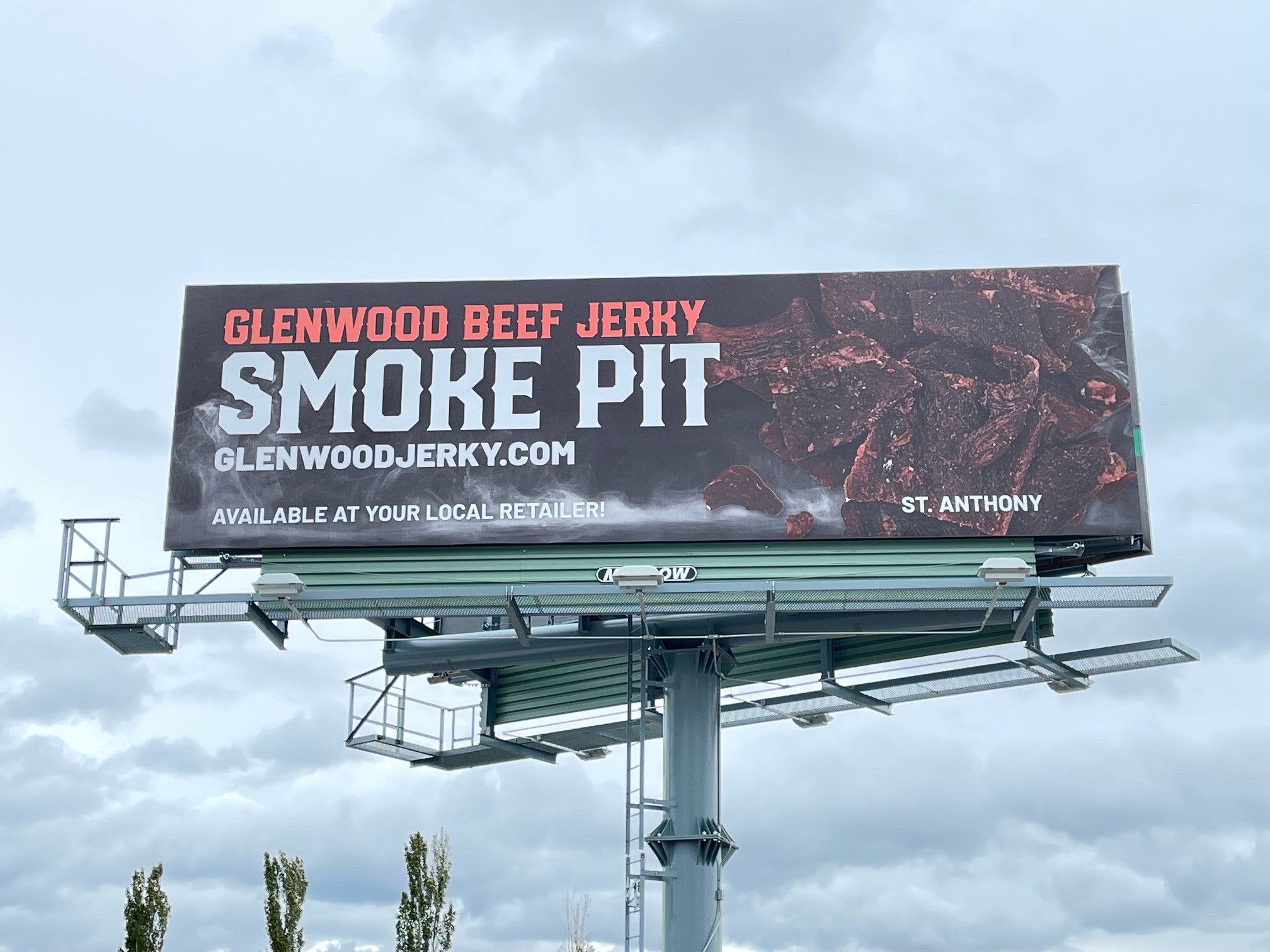
What is more challenging is using a new font that is still legible, fits with the brand, and catches people’s attention. Meadow’s designs for Glenwood Beef Jerky perfectly executes this. The font used is easily readable but has an extra flare that distinguishes the brand from other advertisers.
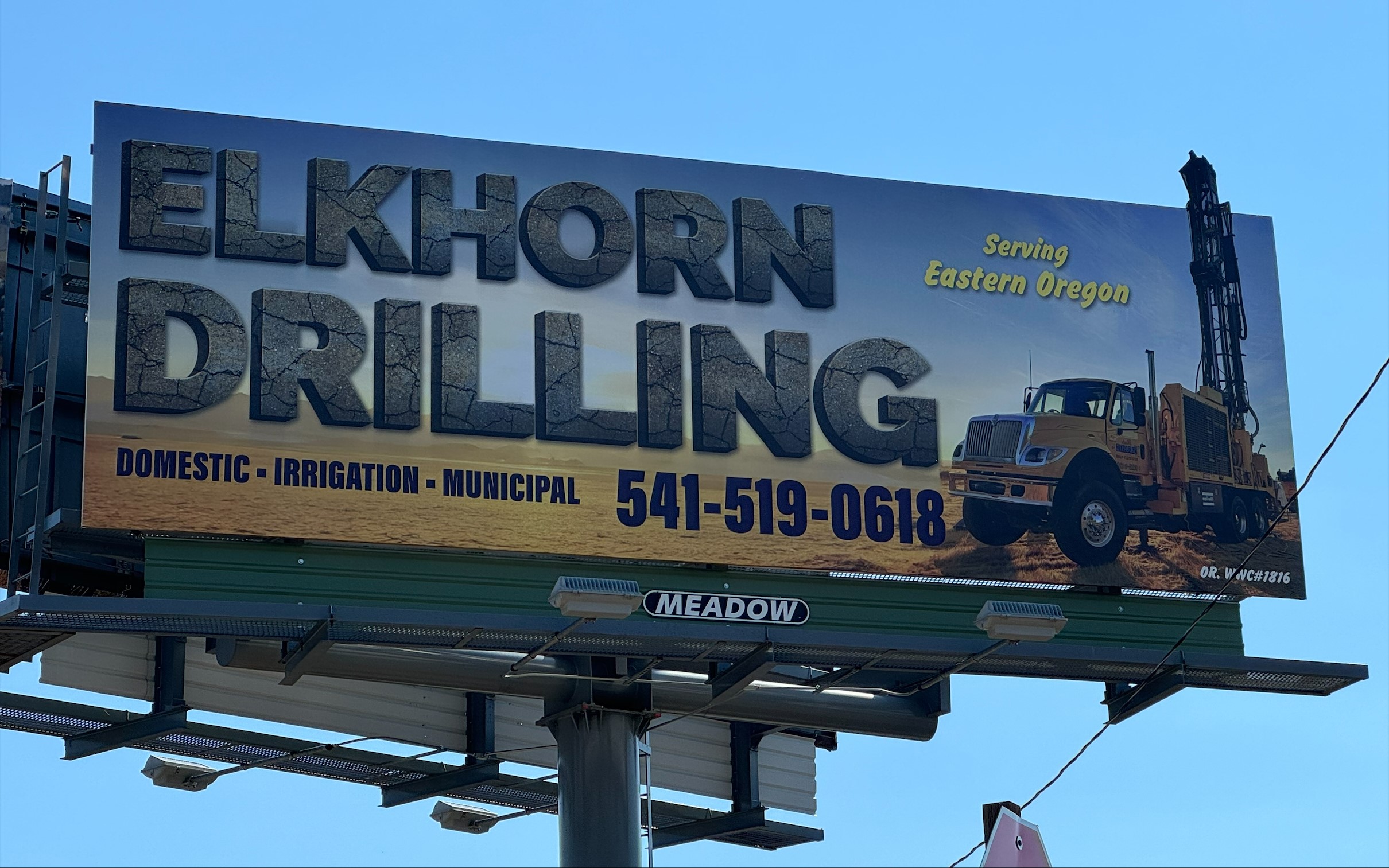
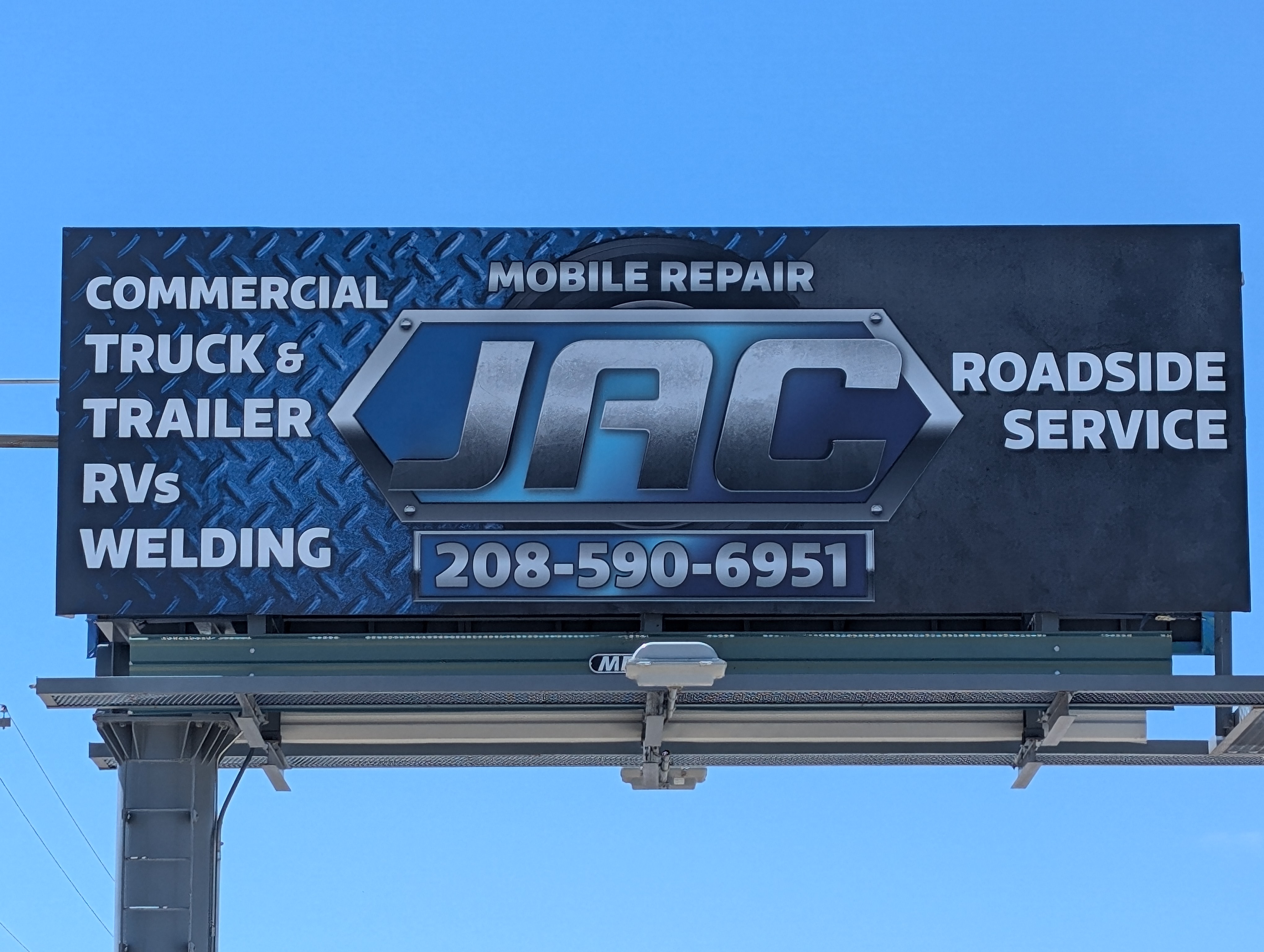
 Another way to be unexpected is to add a texture to an existing font. These two examples from Elkhorn Drilling and JAC Mobile Repair have bold, standard fonts, but cracked concrete texture and the metallic shine add bring an extra flavor to the designs that helps them to stand out from the crowd!

 Break the Rules
Once you know the rules then you can see times when you should probably break them. Creatives should always stick to the brand guidelines. Unless of course they provide a font that would be unreadable on a billboard. In which case you should politely and insistently use a different font that would be more effective.
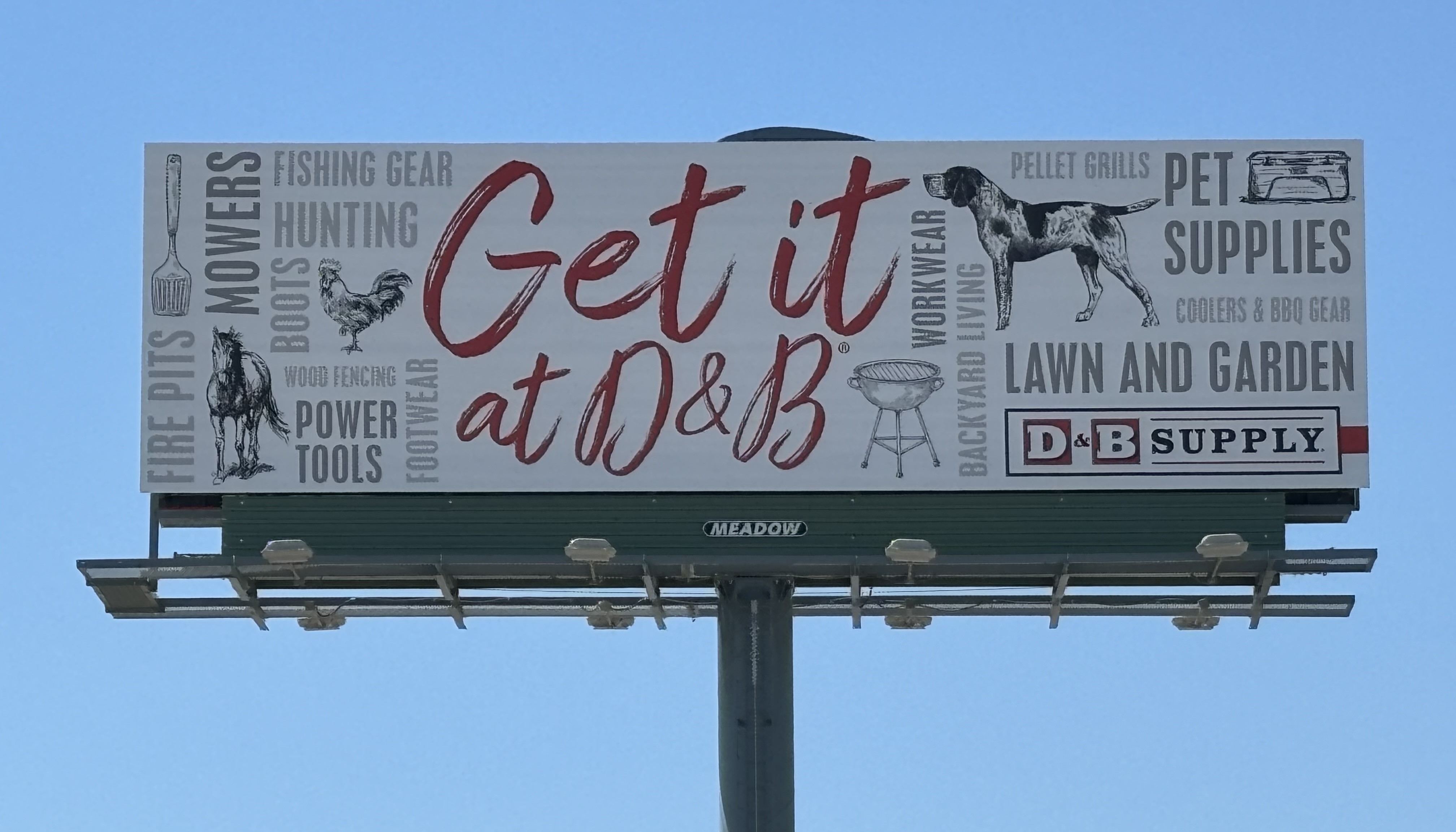
This artwork from D&B supply breaks a lot of rules. Usually, the fewer words on a billboard the better. But this board is covered in so many words that the eye focuses on the main element, the name of the store. The name is also in a script font, but it is large and high contrast enough that it still stands out.
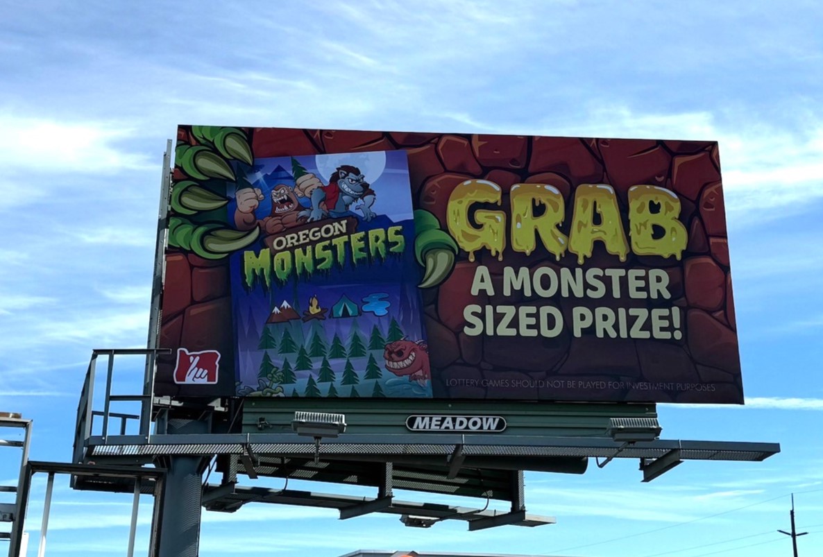
 The given in the billboard industry is that the text on a board will of course be a font. However, some great billboard artwork incorporates the text into the theme of the billboard. Just like this artwork from the Oregon Lottery which has a unique text made specifically for it which differentiates it from other designs.
 Typography can be a blessing or a curse, depending on your imagination. Before you reach for another standard San-serif font, think first about if a more unique font could better contribute to the overall brand aesthetic and help the advertisement get more attention!
If you are interested in advertising on one of our billboards call us at 800-221-4114 or email us at meadow@meadowoutdoor.com!