

.png)
Top 10 Creative Q2 2026
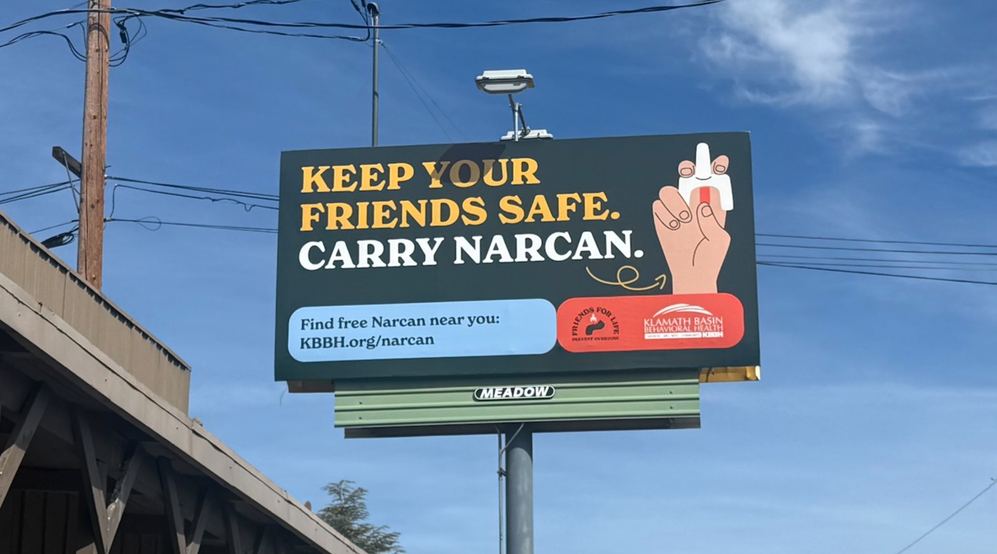
10. Klamath Basin Behavioral Health
The main message should always take center stage, and this copy does so very well. If customers get nothing else, they get the PSA information, and then if they are still interested, they see the smaller website and logo down below.
 9. TJ’s Restaurant & Bar
Showing off your product goes a long way to enticing an audience and communicating with them the vibe of your business. These guys at TJ’s knew their mouth-watering menu item would be a big draw!
-Eugene-TC-2001-1-NF-Installed-04-12-26.jpg) 8. Head Well Integrative Psychiatry & Wellness
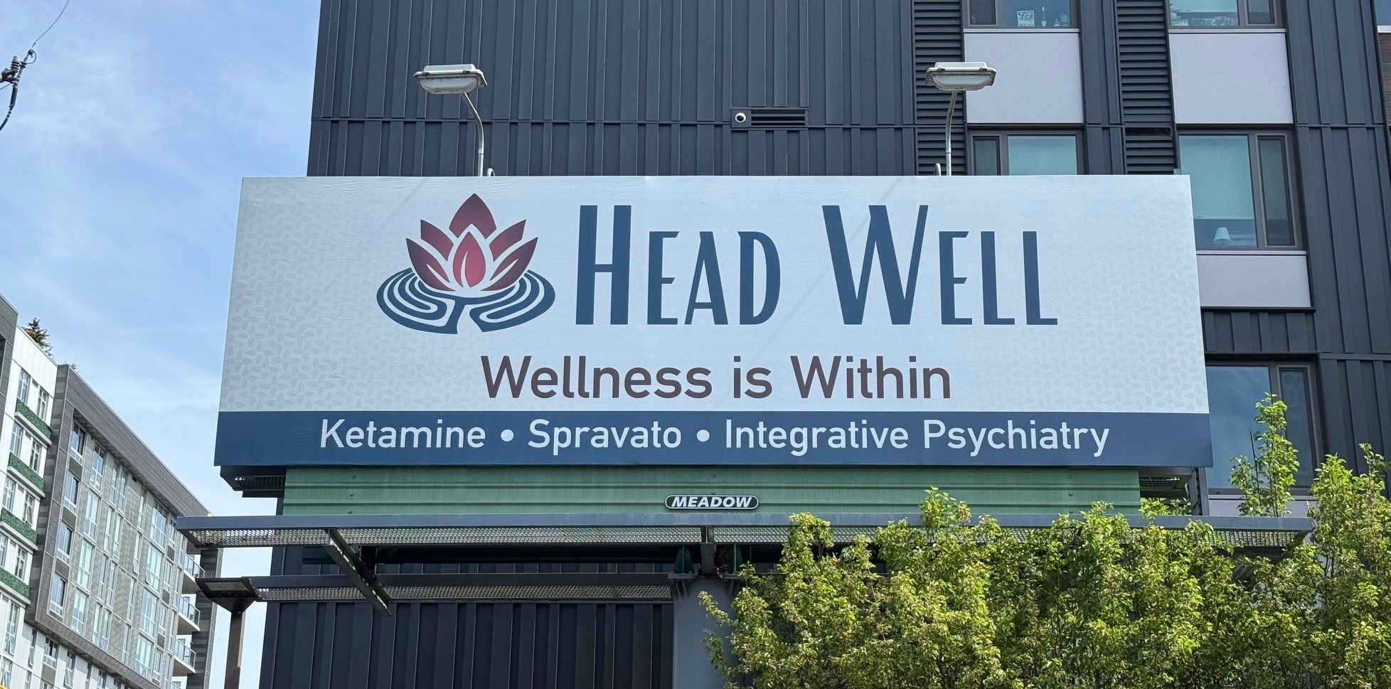
8. Head Well Integrative Psychiatry & Wellness
This copy has wonderful hierarchy and color combination. The blue and pink in the logo contrast so well, and the copy is short with no contact methods in sight!
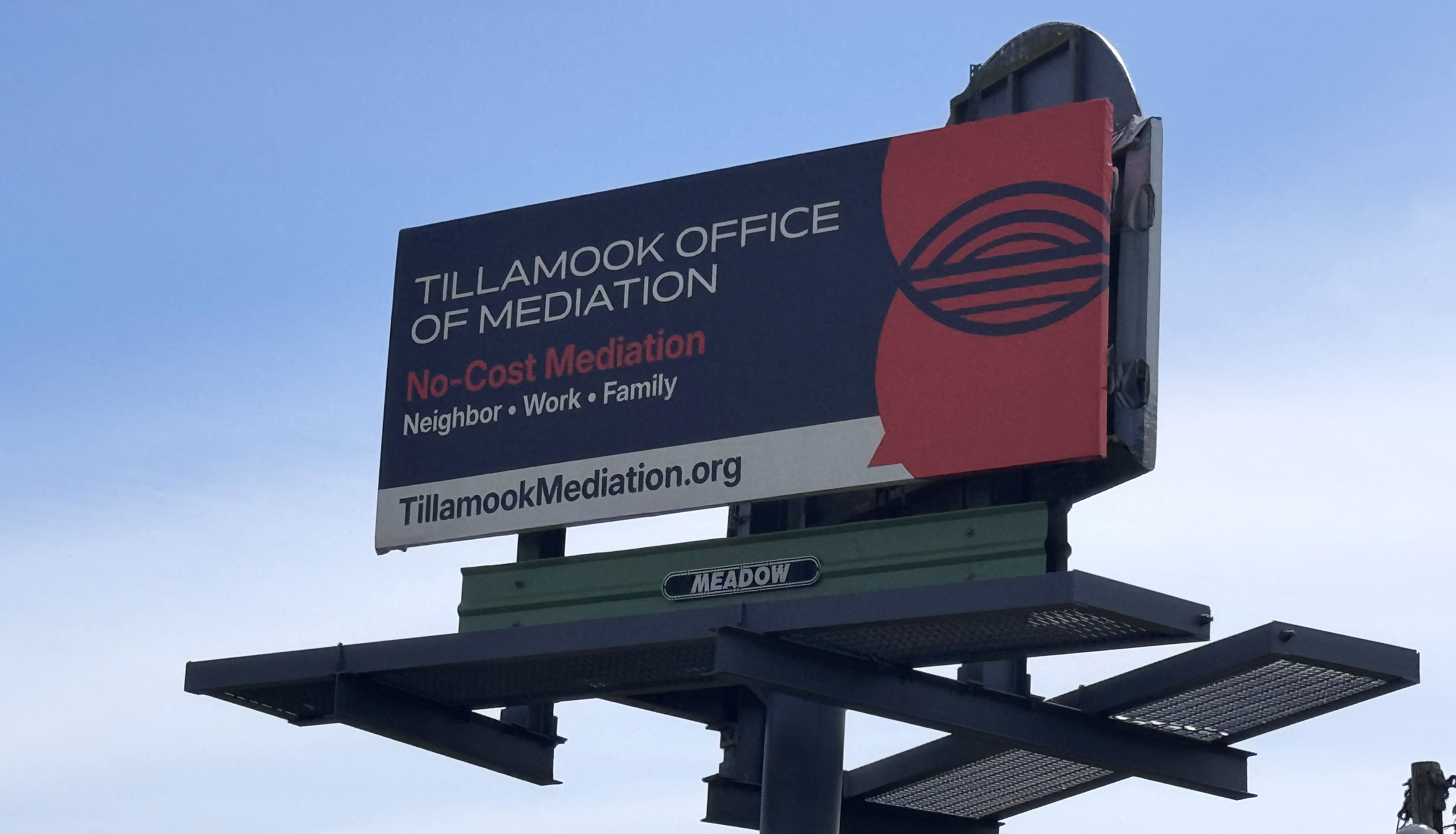
 7. Tillamook Office of Mediation
Billboards can work even for very unique industries like this one! It is readable and straightforward with great hierarchy.
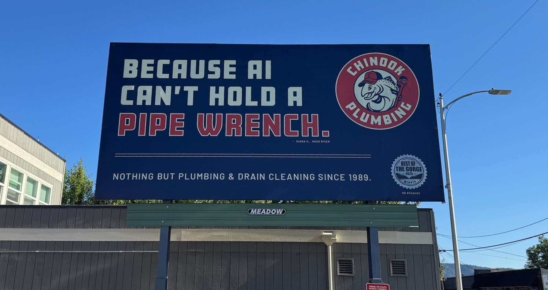
 6. Chinook Plumbing
This client-supplied artwork is super timely and humorous. In addition to the bold font and contrasting colors, this piece is an absolute winner! See people’s reaction on our Instagram or LinkedIn.
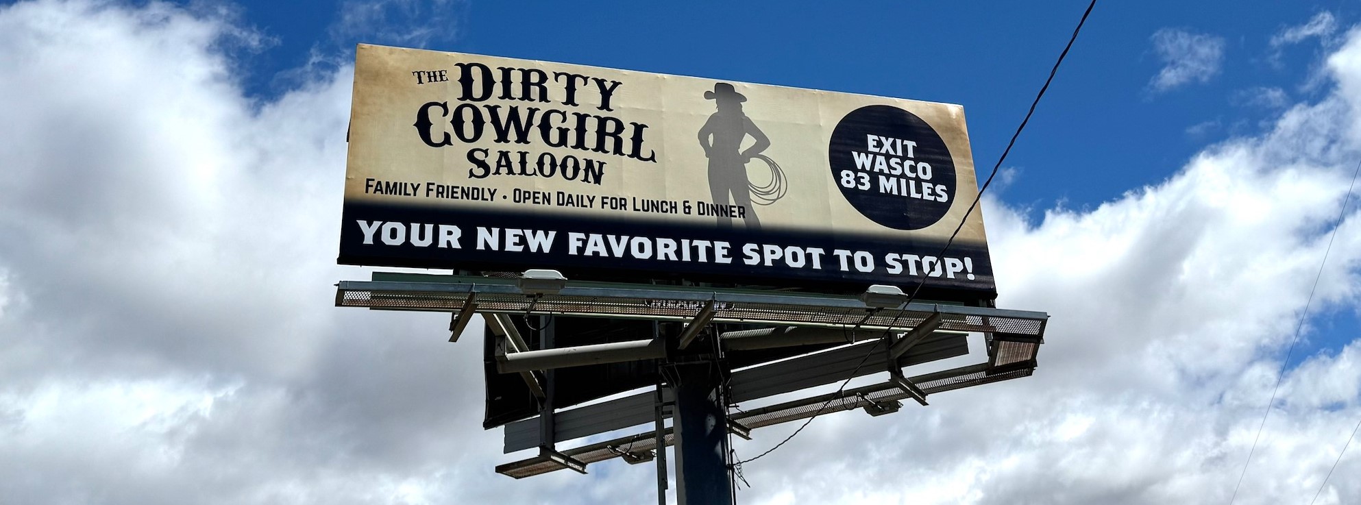
 5. The Dirty Cowgirl
Billboard artwork needs to communicate a lot of information very quickly; the more of that information that can be communicated without copy, the better. This creative’s font, background, and imagery instantly give the viewer an understanding of the business’ personality.
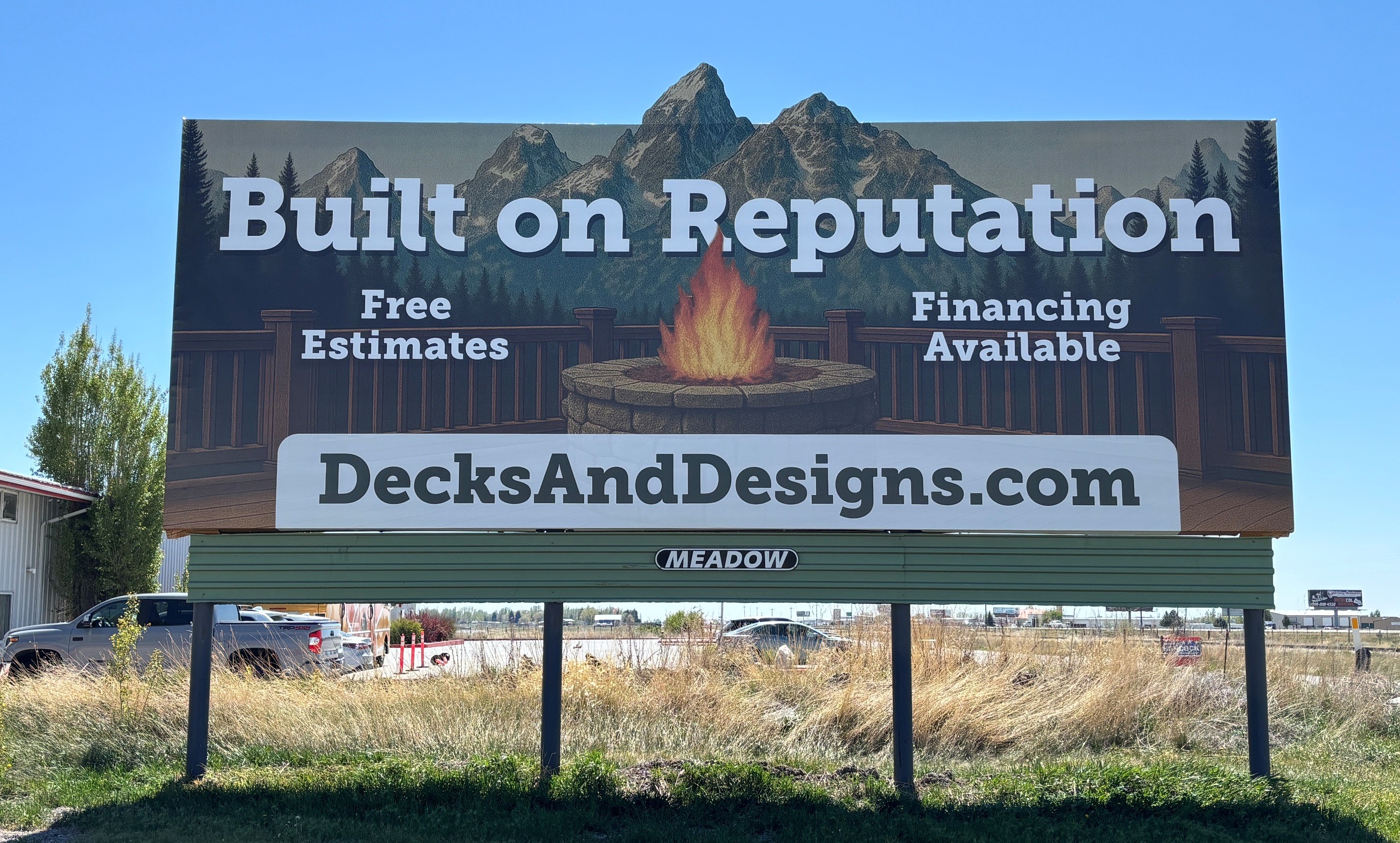
 4. Teton Valley Decks and Design
Billboards don’t always have to have realistic-looking imagery. Illustrative styles can also be useful; in this case, it allows the audience to imagine their cozy dream deck. The fonts are bold and easy to read, with the fire overlapping the text for just a little extra flair.
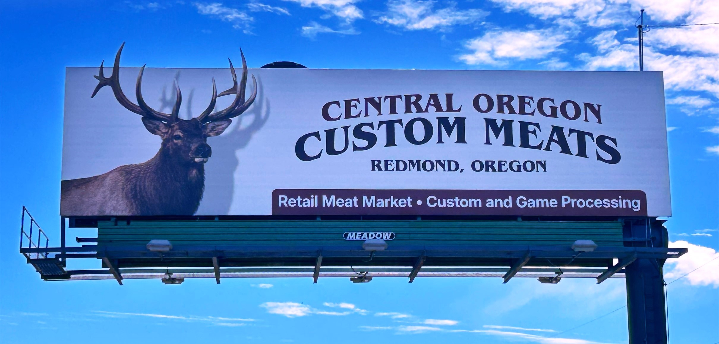
 3. Redmond Smokehouse
Even small extensions will effectively grab attention, like these antlers. There is plenty of space for margins around every element in this design, allowing it room to breathe. It doesn’t feel cluttered or rushed.
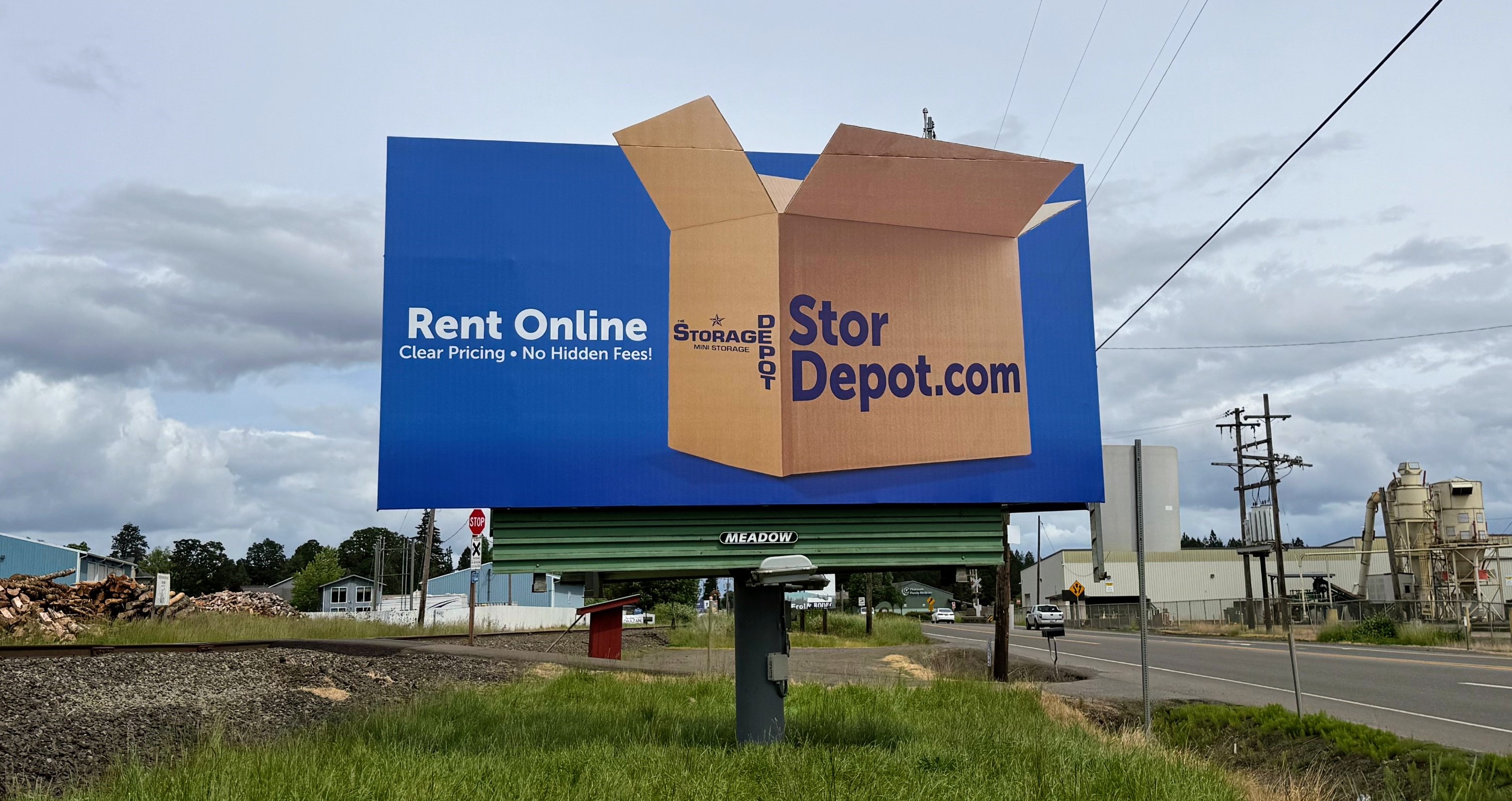
 2. Storage Depot
This design is literally out of the box! The blue is super vibrant, drawing attention to the billboard. It can be difficult to make exciting designs for not-so-exciting industries, but in this case our creatives pulled it off!
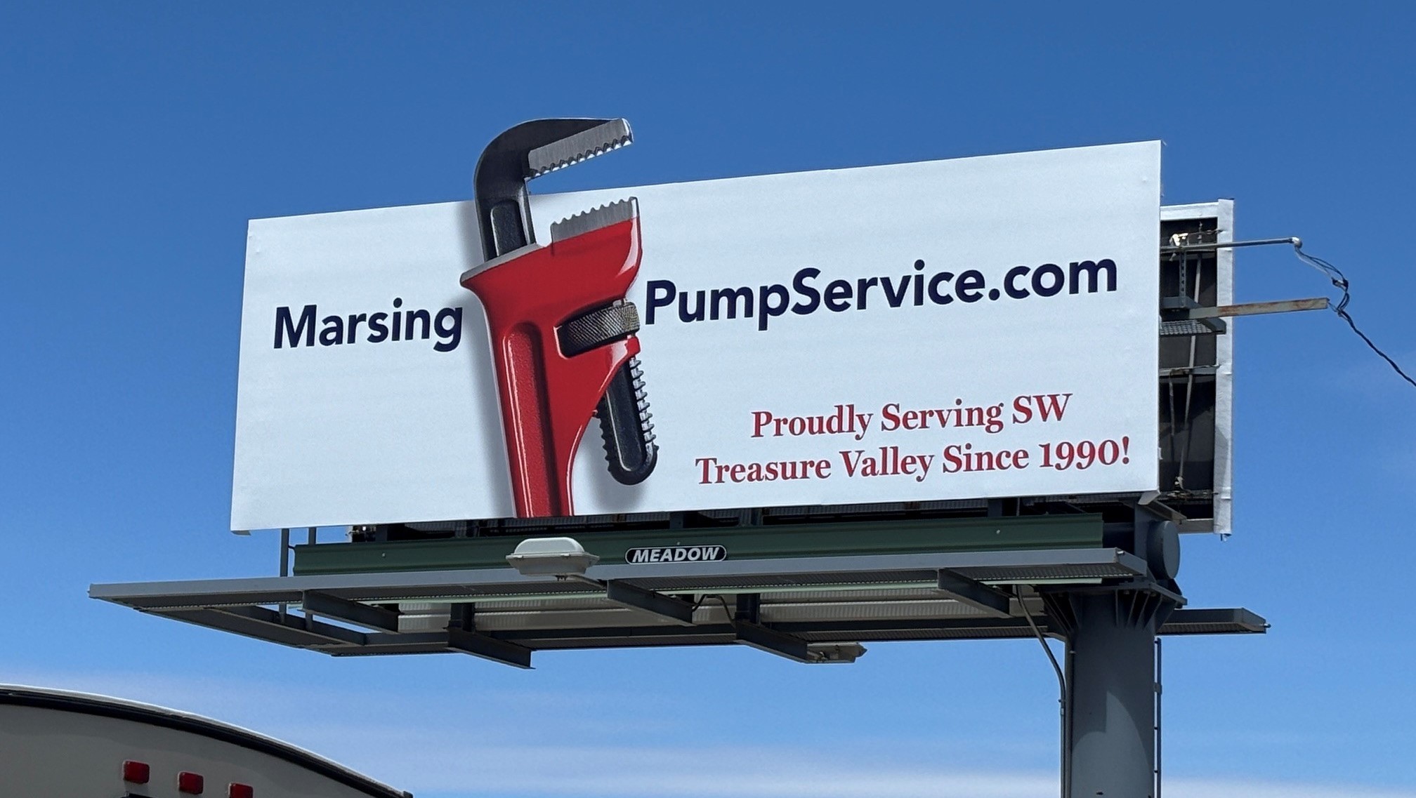
 1. Marsing Pumping
Simple designs are very difficult to pull off but are always worth it! The bright red extension of a wrench is certainly eye-catching, and only the most important copy made it onto the billboard, making this artwork beautifully simplistic! To see more about this artwork, see Billboard Insider’s commentary on it.
If you are interested in advertising on one of our billboards call us at 800-221-4114 or email us at meadow@meadowoutdoor.com!