How to not let your Billboard Blend into its Surroundings
Billboards need high contrast to make an impact. The images need to contrast, and the copy needs to contrast with its background. But also, the entire billboard needs to contrast with its surroundings. Billboards have physical locations that are each unique, and to make the best impression, the billboard will need to contrast with its environment. So how as billboard artists do we ensure that happens?
The first step is to check what the out of home industry calls the proof of performance photo or POP, before you start designing the billboard. A POP will show you where the billboard is located and what is around it. Is it high in the sky or low to the ground on a hill of dead grass? It is in front of green trees or on a busy city street? Depending on the location, some colors will blend into the environment more than others. Using a baby blue background on a billboard in the sky could kill the artwork. Using dark green on a display in the forest will ensure that no one sees the client’s message.
If you are unsure of the background behind the billboard, a safe rule of thumb is to not use natural colors. Bright reds, yellows, oranges, purples, and pinks are a much safer bet than neutral tones or soft blues.
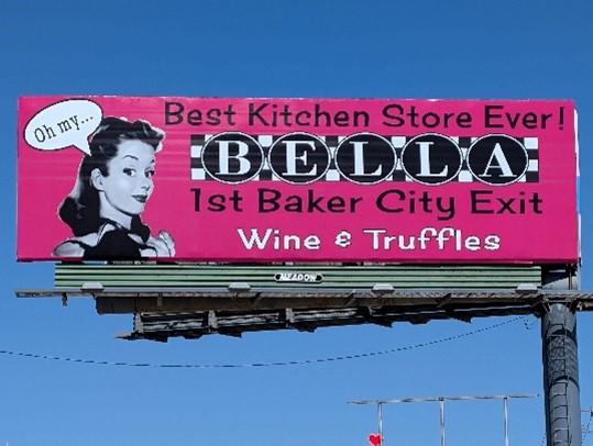
Bella Main Street Market has many billboard displays in Eastern Oregon which stand out from their surroundings. Their signs will stand out against sky, trees, grass, or anything else because their signature hot pink is such a bright and unnatural color.
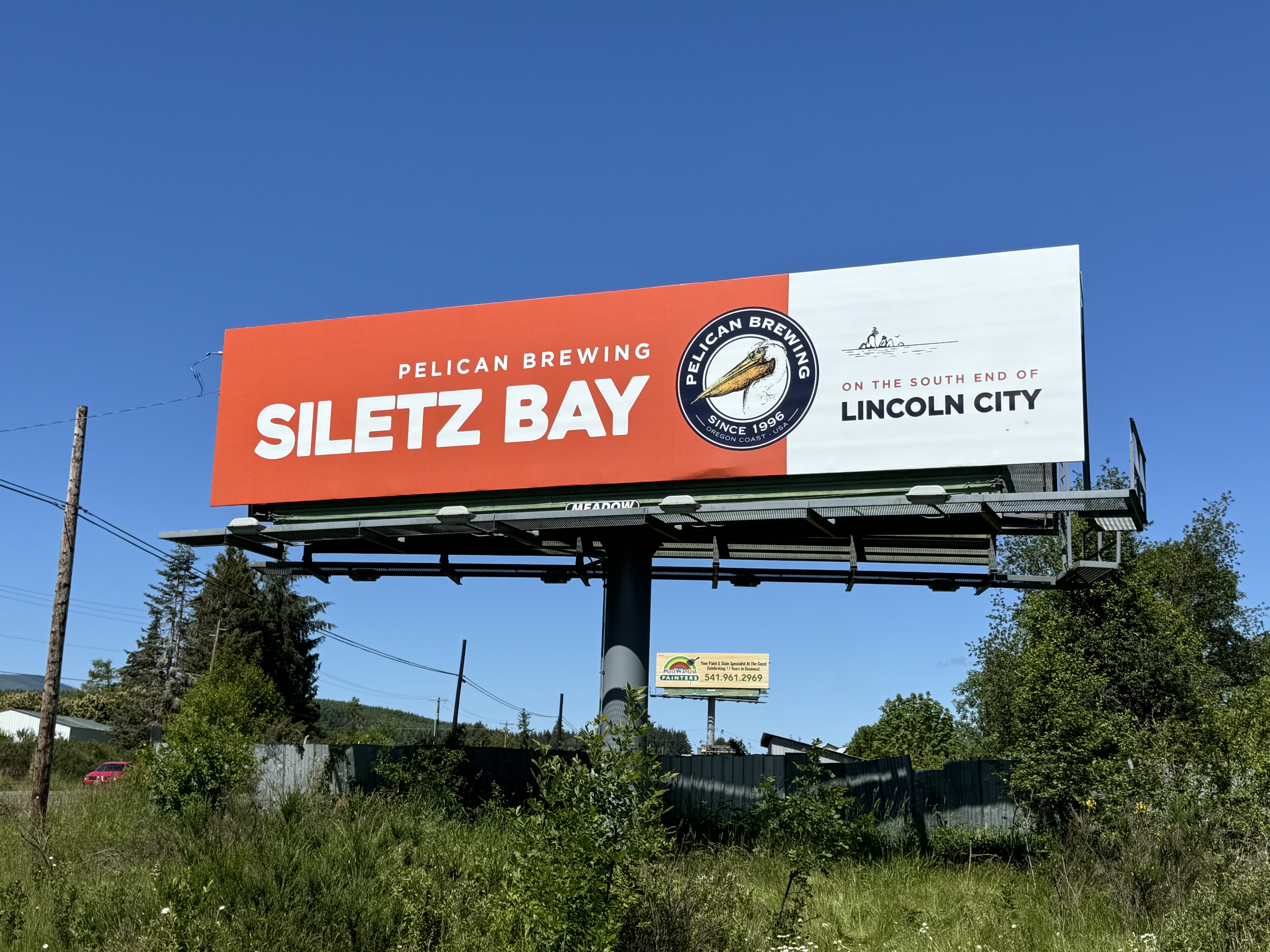
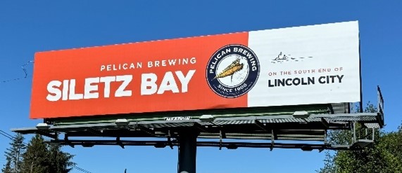
 Another example would be the recently installed displays for Meadow’s client Pelican Brewing with locations all along the Oregon coast. This highly saturated orange is bold and contrasts perfectly with the sky!
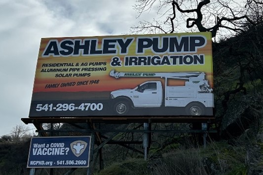
 Ashley Pump and Irrigation has a billboard display in The Dalles, OR. Their artwork used to be green and white, however when they renewed with Meadow, they specifically requested to have their artwork contrast more with the natural landscape. So our creative team put together this bright orange display that would pop against the natural green of the hillside.
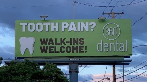
 It might seem like this means billboards should never utilize blues and greens. This is not true, and our client 360 Dental proves that with their billboard in Eugene, Oregon. It’s a vibrant green that pops against the blue sky.
 So, billboard artists, before you even begin conceptualizing your design, think first, what colors should I use to stand out from my surrounding on this billboard?
If you are interested in advertising on one of our billboards call us at 800-221-4114 or email us at meadow@meadowoutdoor.com!